
Last year we paid for a proper brand kit. Logo set in every variant, a branding guide, stationery, the works. It was purple: a mid purple with a deep purple beside it, and honestly, it looked good.
Then we built our website this year and dropped the purple entirely. This post is the reasoning, because a rebrand without reasoning is just redecorating.
The old and the new
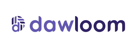

Look closely and you’ll notice the geometry didn’t change at all. The mark, a “d” built from segments, survived untouched. We recolored, we didn’t redraw. Good bones deserve to be kept.
Purple became the color of default
When the branding was made, purple read as creative and a little technical. Then AI happened to the design world. Open ten AI startup sites today and you’ll find the same thing: purple or violet gradients on white or near-black, glowing accents, the whole family. Purple stopped being a choice and became the default that design tools and templates reach for.
We’re an agency that builds a lot of AI products. Showing up in the same purple as every template felt like introducing yourself in someone else’s voice. Worse, we tell clients that their product shouldn’t look like it came off an assembly line, and our own brand was quietly heading there.
What we did instead of guessing
Before choosing new colors, we studied sites we admire and measured them instead of vibing. The one that taught us the most is warm where its whole category is cold: browns tinted like old machinery, a cream that reads as paper instead of white, one hot accent used sparingly. Infrastructure that feels settled rather than trendy.
That became our direction, in our own mix: a yellowed cream base, a warm near-black we call ink, and one flame orange that gets used for exactly one job, pointing at things you can act on. A gold, rust, and plum stripe shows up as a small recurring motif and nowhere else.
The logic is simple. In a sea of cool gradients, warm print-like surfaces are instantly distinguishable, and they age better because they were never fashionable in the first place.
The font footnote nobody talks about
The rebrand also fixed a quiet legal problem: our display font was a trial license. Shipping a company site on a trial font is the kind of small dishonesty that becomes a real one later. The site now runs on open licensed fonts: Outfit for text and Archivo for the big headlines, both self-hosted, both preloaded so you never see the text flash.
A rebrand is a cheap promise
New colors cost nothing to promise and everything to keep. The brand only means something if the thing behind it matches: a site that loads in under a second, reviews that link to sources you can check, and prices agreed before work starts. The palette is just the wrapper we chose for that.
If your product’s brand has drifted into looking like everyone else’s, we’ve been through it ourselves, and we can help.